Paul Nash bookplate for art collector Samuel Courtauld

Found - a loose bookplate by Paul Nash  for the industrialist and art collector Samuel Courtauld. Produced around 1930, it measures a sizeable 13 by 9.5 cms, probably intended mainly for art books and livres d'artistes. The writer and broadcaster Lance Sieveking writes in his autobiography The Eye of the Beholder (Hulton Press, London, 1957) -'Sam Courtauld and Paul met at a dinner party I gave at Number 15 The Street, and Courtauld persuaded Paul to design a book plate for him. The result was one of the most charming he ever made.' The engraving is said to be the only one initialled by Paul Nash on the block. The bookplate is quite scarce as, presumably, it is mostly found in books held at the Courtauld Institute; few have entered the used book trade.

The woodcut is British Surrealist in style with an echo of Cubism and Vorticism - both movements had earlier attracted Nash. Samuel Courtauld's family fortune came from the textile industry (rayon), hence the bobbin and threads. The French flag refers to the origins of the name Courtauld, a French Huguenot family whose early descendant was the celebrated goldsmith Augustine Courtauld. The Courtauld textile industry was based in Braintree and Halstead in Essex. The view through the frame shows what appears to be a Martello Tower - these are closely associated with the  East Anglian Coast.

Give Puce a Chance

Thoughts on puce suggested by this (presumably) early 1914 pamphlet. Wyndham Lewis's Vorticist magazine BLAST (aka 'the puce monster') appeared in July of that year, the same month as war broke out and the pamphlet, judging by the title, appeared earlier that year. Was there a load of puce dye offloaded in London at that time, was it the colour of the moment? Is this really puce? Ezra Pound called Blast  “the great MAGENTA cover'd opusculus” The big Bloomsbury dictionary describes puce as 'a brilliant purplish red colour.' Did Wyndham Lewis spot someone hawking the pamphlet in the street, it seems quite possible - even the typography is similar (at least the angular printing...)

The pamphlet (of which I have the cover only) is unknowable, no such title shows at WorldCat or Copac and the title page may have born a different title and possibly the name of an author. A colour that used to be seen in the 1990s 'hot pink' was similar to puce but rather cheap looking; the 1940s Elsa Schiaparelli colour 'shocking pink' is nearer to the mark but puce has a glamour all of its own. A fine copy of the first BLAST is a rare and valuable thing. They usually turn up in distressing shape; as for the war pamphlet it is probably too rare to have real value.

Below is a recently added and obviously modern puce punk publication - of which I know nothing, except it appears to be part of the enviable collection of kunstler Richard Prince. Such material was highly collected a few years back but  the punk artefact looks somehow more dated than the irascible Lewis's 100 year old puce monstrosity…

British Surrealism – Arson – an Ardent Review (1942)

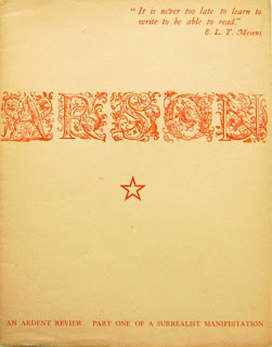
Toni del Renzio. ARSON. AN ARDENT REVIEW. Part One of a Surrealist Manifestation. London, 1942.

Although billed as 'Part One' this was the only issue of this surrealist magazine of 'incendiary innocence' ever to appear. Several other magazines, mostly smaller in format and associated with E.L.T. Mesens appeared and all have become quite hard to find and consequently expensive. Del Renzio was a key figure in British Surrealism, never a burgeoning movement but oddly attractive and now quite collectable. Under the headline 'SUPERDAD' the art journal 'Studio' published this obituary for him in Febuary 2007:-

Toni del Renzio has died aged 91. Truer than life always, he was born to a landed Italian family outside St Petersburg, where his father was a diplomat to the Tsarist court. He had a legendary and varied life, not least in contributing to Studio International, with whose editor, Peter Townsend, he established a natural rapport. Fluent in several languages, he had fought in the Spanish Civil War but ended up in the lap of the Surrealist movement in Paris. On eventual arrival in London, he founded the Surrealist magazine Arson.

In 1951 he joined the Institute of Contemporary Arts and was involved on exhibition panels and juries. For a time back in Italy, he became the Fashion Editor for Harpers Bazaar, and then reorganised the Milanese magazine Novita as Vogue Italia. He staggered his friends and acquaintances much later on by becoming, at the age of 70, the father of quadruplets, two sons and two daughters: and then wrote about it as if it was the most natural thing in the world, which for del Renzio, it was. His métier was the surrealist collage. He became distinguished as a teacher, both at Bath and subsequently at Canterbury, where he was Head of Art and Design History. Vale, ti saluto, Toni del Renzio, maestro.

Antonio Romanov del Renzio dei Rossi di Castelleone e Venosa (to give him his full name) was a mercurial character and as a surrealist spent a lot of time engaged in aesthetic and political arguments, being at one time being considered a monster by the Mesens crowd. His key work 'Arson' was partially financed by Ithell Colquhoun whom he married in 1943 and divorced in 1948. He was also, briefly, the lover of the surrealist painter Emmy Bridgwater.

In 1942 de Renzio also mounted a London exhibition entitled Surrealism resulting in more general recognition for the movement. Arson was printed on turquoise stock and decorated on the front cover with surrealistic appropriations of steel engravings, printed in purple. Collage was a favourite medium for del Renzio. Contributors included Robert Melville, Giorgio de Chirico, Conroy Maddox, Nicolas Calas, Pierre Mabille + an interview with André Breton. Books by TDR are quite collectable--his 1968/ 1969 paperback on hippies 'The Flower Children' is very uncommon and his 1971 book After a Fashion is highly elusive.